I’ve been hunting for a great MacBook Pro replacement since early 2017 and while I’ve been happy with my switch to a desktop machine at home, it’s been an interesting journey trying to find something that’s on the same all-around hardware and software experience on the laptop side.
Over the past year I’ve spent time with the Razer Blade, Dell XPS 15 and the Eve V, which are all stellar machines, but I didn’t quite feel at home yet. These are fantastic machines that do the job well, but always left something wanting, which I figured I’d need to settle for.
I’m back to say I was wrong, and I’ve found a machine that not only matches Apple’s standard of hardware quality, but goes far beyond it to demonstrate how a laptop of the future should work.
That machine is the 15-inch Surface Book 2 and somehow Microsoft has made the 2-in-1 that Apple should’ve been building all along, to the same level of quality I’d expect from anyone other than Microsoft.
I’ve used the Surface Book 2 as my daily computer for three months now and it’s consistently blown me away with how well considered it is across the board, how great the software works and has completely converted me into the touchscreen laptop camp.
I’m not your typical reviewer but rather a person who needs more out of their machines than most.
I’m a software developer and UX writer who spends my days either in a text editor or building and debugging PHP applications (including my own) in an IDE. I needed a machine that could offer enough power to get shit done, but is lightweight and flexible enough to do other things, like watch movies and do some light gaming.
I don’t want a serious gaming monstrosity, I just desired something that can do the job well, had great build quality and could run the Unix-based tools I need to use to get through the day while offering reasonable battery life. It’s a tall order, but should be feasible.
While a touch screen, ink-compatibility and other things weren’t really on my list, the Surface Book came onto my radar when it was first released a few years back by just how sheer adaptable it is. That was a laptop of the future, and it looked promising, but at the time only came in a 13-inch version.
When Microsoft introduced the larger 15-inch version in late 2017 with a 6GB GTX 1060 graphics card, my interest was piqued: could this be the Mac-quality alternative I was looking for? At the time, it wasn’t available in Europe at the time so I went with the XPS 15.
On a recent trip to the US, however, I decided to get one to try it out and see if it lives up to the hype. Here’s the very long-winded detail of how I fell in love with a convertible, and why I’m now using it as my daily driver.
High quality hardware

The Surface Book 2 is one of the cleanest, beautiful pieces of hardware design I’ve seen in recent times, and I love that hardware is getting weird again in all sorts of ways. Microsoft deserves more kudos for pulling this off, because it’s fabulous to look at and still functional without compromising on the aesthetic.
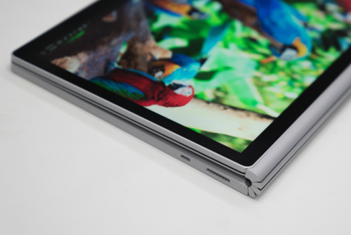
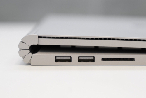
While the hinge aesthetic itself on this laptop might be incredibly divisive, I really love the element of quirkiness it adds — personality for a laptop design language that’s traditionally been made up of boring rectangles.
The body itself is encased in magnesium that’s satisfying to touch and stands out from anything I’ve used before it. The casing is never too cold to the touch while feeling soft, and doesn’t get finger goop all over it like the Dell XPS 15 did.
It feels premium in the hand, but sturdy enough to last, and doesn’t feel cheap. There’s no flimsy bits at all, just end-to-end metal, without logos or stickers to tarnish it.
Display

Hands down, the screen is one of the best in the industry and lives up to what you’d hope only out of a Retina display, while still pushing the boundaries.
The display is able to produce rich colors, a ton of brightness and looks fricking great. If you care about pixels as much as I do, and you want to get as high resolution for working on the go as possible, look no further, but it gets better.
One reason I had interest in this device in the first place was the 3240 x 2160 resolution, which is a quirky 3:2 in a world of wide, vertically-limited 16:9 aspect ratio laptops.
Such a resolution, however, is far better than your average laptop for one big reason: you get a bunch more vertical screen real estate to play with, which I love, because I spend most of my day working on this thing, not watching widescreen movies.
The vertical space on a MacBook or XPS is always extremely limited to the point that I’d always preferred putting the dock on the left of the screen to scrape out as much as possible, so using the Surface Book 2 is like stepping into a room with incredibly high ceilings for the first time: liberating.
The 15-inch size of the screen works incredibly well in practice, surprisingly in tablet mode, because it’s like a slightly oversized piece of A4 paper. That said, if you thought that the iPad Pro looked stupid big, you’re now in oversized clipboard territory. Yeah, it’s stupid big, but the size of the canvas lends itself to taking detailed notes, drawing doodles or sketching out diagrams with enough space to really use it.
At first the size made me embarrassed to use tablet mode public, but then I got to the point where it just felt freeing: enough space to actually do the pen justice, and certainly enough to fall in love with it over, say, a Wacom tablet if you happen to be an illustrator.
Keyboard / trackpad

The biggest stumbling point for PC makers has traditionally been the trackpad and keyboard, which are often either disappointing or downright deal breakers for those looking to switch away from a MacBook.
The bar is high because Apple’s been good at this for years and most PC makers’ trackpads would trigger accidental scrolls, taps or even just outright barely work.
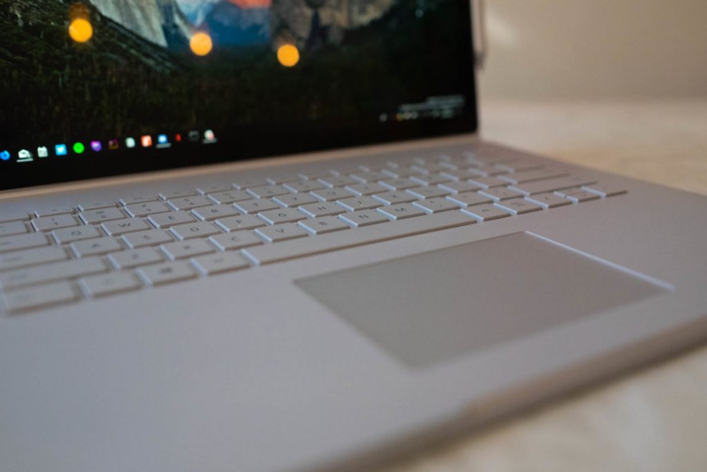
I am incredibly skeptical of any PC for that reason, but was pleasantly surprised by how not terrible the trackpad and keyboard are. In fact, it was surprising to me that the trackpad is beyond great in practice. It just works, the way you’d expect, and I’m happy to have nothing else to say there.
It’s the first time I’ve found Apple-level trackpad quality on any other machine and it’s just delightful.
If, like me, you’re coming from the Macbook Pro with the butterfly keyboard, I promise that typing on this thing is salve for your butterfly-keyboard wounds: it’s got a perfect amount of travel, feels comfortable to use and doesn’t sound like you’re typing on a hollow piece of wood.
In other words, I’m really convinced that Microsoft finally nailed the combination of hardware and software needed to make a laptop that wasn’t infuriating to use. Input is so key to getting this right, and the combination is finally reaching the bar that’s been consistently missed for years.
The Surface Book 2 might be a bold convertible, but it’s not hindered by compromises like crappy text input — it’s a damn delight to use on a daily basis.
No dongle required

For connectivity, if you’re comparing to the MacBook Pro the Surface Book 2 is basically a home-run: you get two USB 3.0 ports, a Magsafe charger (!), a USB-C port (which can also be used for charging), and an SD slot.
In other words, it’s perfect, and you can basically stop with the dongle hellscape that is 2018 with the Surface Book, because it solves it by just being pragmatic. What Microsoft has done with the combination of ports here is refreshing, with a caveat that we’ll discuss later:
- There’s a magnetic charging port which does a lot more than just charge: it’s also able to be used for connectivity. Add a Surface Dock, which uses the same port and you’ll get charging, displays, networking and more.
- Having a native SD slot was something I’d actually missed, so having it back is even better for those occasions where you need to quickly offload a card.
- The audio jack is at the top right of the screen which is an adjustment because it means your cable will be suspended from the right of your display. This is necessary so you can still listen to audio in tablet mode.
- The charging ports are also inexplicably on the right-hand side of the base, where every other laptop in existence has it on the left-side — this results in an annoying wire floating around right next to your mouse if you don’t arrange it carefully.
- We have USB-C connectivity, which is a welcome improvement with a catch we’ll go over later on in this piece.
Split it up
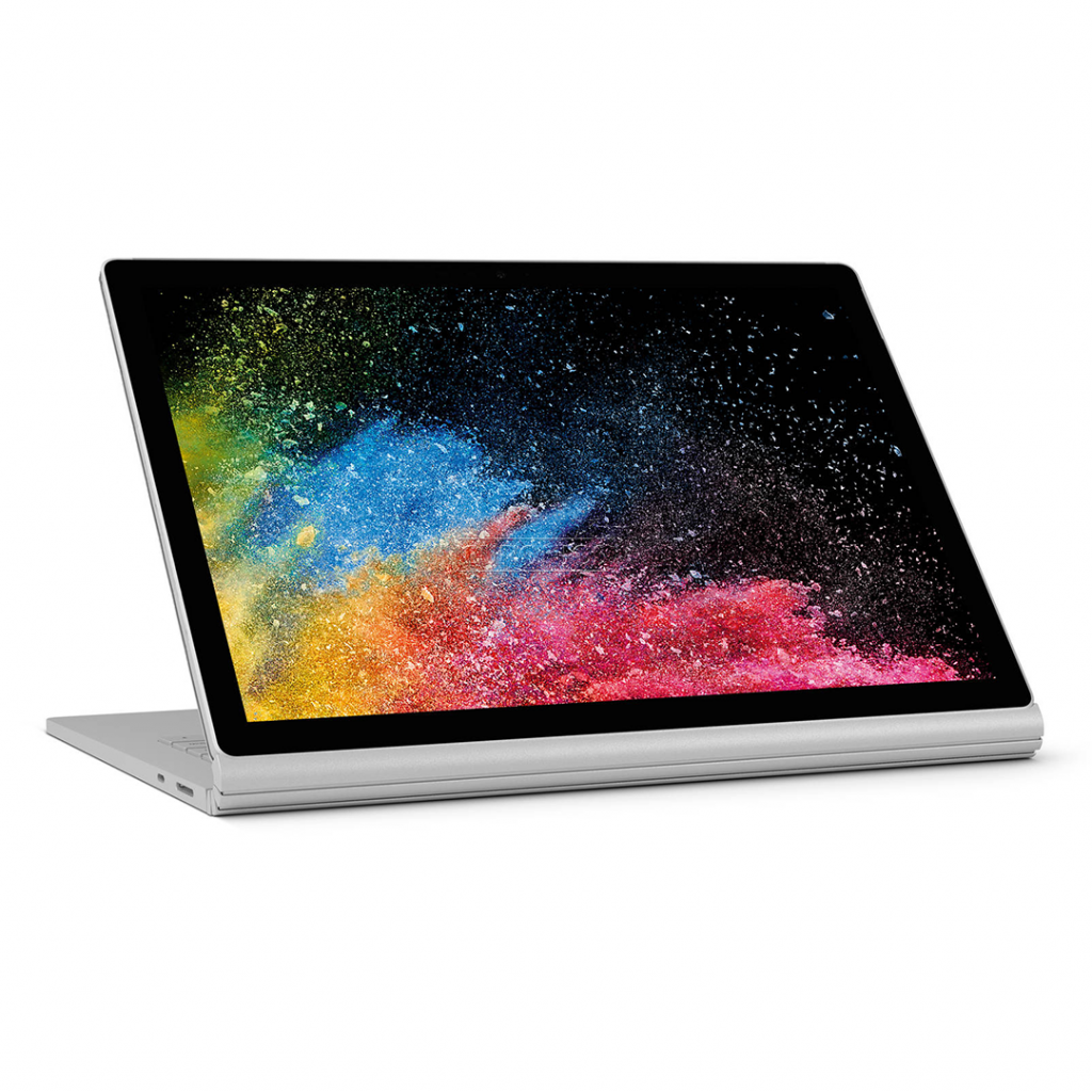
One of the Surface Book 2’s marketing angles is that it’s a full-on computer with a wild secret superpower: it’s a full-on tablet too. All you need to do is push a button on the top right of the keyboard to eject the screen, and boom, you’ve got a tablet computer without giving up any of the conveniences of your full computer.
How Microsoft actually pulled this off, in practice, is impressive: the bulk of the Surface Book’s computing power is inside the display, as are the speakers and headphone jack. In the keyboard you’ve got a bunch of ports, a huge battery and a high-end graphics card, the nVidia GTX 1060 — if you pop off the screen, it’s a whole computer, without any compromises. Pop it back on and you’ve got a whole computer with a kick-ass graphics card.
Essentially, you’re getting the best of both worlds: you’ve got a great tablet computer like the iPad Pro, mixed with a laptop like the MacBook Pro. This seems like a gimmick on the surface, but it’s a life changing feature that’s totally undersold: I use both laptop and tablet mode daily, and it’s totally transformed my workflow.
I’m a full-time freelance marketing and UX writer, so I’m often working in-person with clients in person. Being able to pop off my keyboard and write directly on the screen when we’re brainstorming to draw all over a screenshot helps a lot, but giving remote clients feedback with the tap of the pen eraser is incredible for getting the message across in one go.
I often catch myself quickly snapping a screenshot, drawing on it, and flicking it off with the native Mail app for feedback, or drawing up a wireframe to show how we could use copy and layout better, which saves writing out a few hundred words on a regular basis.
My worries about the transition from a desktop workflow to a tablet one are a relic from the days of Windows 8, where you were stuck in a weird tablet-interface land all the time. It felt forced at best.
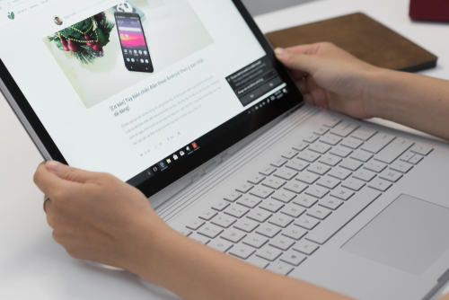
Microsoft has done a great job of fixing that, and now seamlessly hands you off into a touch-friendly mode when you’re using fingers or a pen, and a mouse-friendly interface when using the laptop format — and if you prefer, it can ask you which mode you want to be in when it’s ready to switch between them.
I’ve spent a ton of time with the iPad Pro and the Apple Pencil. They’re incredible devices but constantly remind you of their own limitations as you’re using them. The Surface Book is so much more powerful because it’s already a part of your workflow.
You don’t need some other device in there to get a specific task done, or to try and make the iPad Pro a serious computer: it’s already in your backpack and it’s the same one you’re already using all day, just push the eject button to switch gears.
Microsoft spent so much time with the stylus to get it just right so they could compete. That’s another thing I was initially skeptical of because since the Windows XP era support for ink support on Windows has been underwhelming, but it’s come a long way.
The response time on the pen is just as good as the iPad Pro, and the way it feels as it glides across the screen is really satisfying, as if you’re writing on paper rather than jabbing a piece of plastic up on a slab of glass.
Microsoft has done a good job of making its pen more useful on a day-to-day basis as well:
- The eraser on the pen doubles as a button for launching an app, taking a screenshot or writing down a note, and can be configured based on the amount of times it’s clicked. This is huge if you’ve popped the screen off and need to quickly write something down, and tapping once to scribble on a screenshot is something I’ve come to use regularly.
- The pen can magnetically attach to the screen on the left or the right, making it a lot harder to lose.
- OneNote, Microsoft’s main app for taking notes and drawing scribbles, is really great at being a jot-pad for later. You can write as messy as you like, then select it later and it’ll use handwriting recognition to convert it into text.
Microsoft calls all of these stylus-related features ‘Windows Ink’ and I can safely say I’m a skeptic turned into a believer here.
